Components
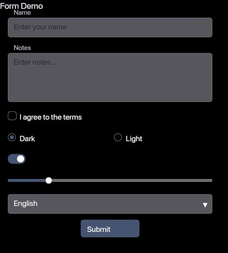
30+ components ready to use. Targeting parity with shadcn/ui and daisyUI.
Primitives
Button
ImplementedPrimary action element with glass, solid, outline, and ghost variants.
Badge
ImplementedStatus indicators and labels with accent, success, warning, and error variants.
Label
ImplementedText labels for form fields and UI elements.
Link
ImplementedNavigation links with hover states and external link support.
Separator
ImplementedVisual dividers between content sections.
Spinner
ImplementedLoading indicators for async operations.
Kbd
ImplementedKeyboard shortcut display elements.
Inputs
Input
ImplementedText input fields with validation states.
Textarea
ImplementedMulti-line text input for longer content.
Checkbox
ImplementedBinary toggle for multi-select options.
Radio
ImplementedSingle-select from a group of options.
Switch
ImplementedToggle between two states with smooth animation.
Slider
ImplementedRange input for numeric values within bounds.
Select
ImplementedDropdown selection from a list of options.
Feedback
Alert
ImplementedStatus messages for success, warning, error, and info states.
Tooltip
ImplementedContextual information on hover or focus.
Toast
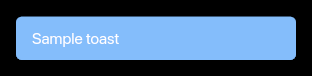
ImplementedNon-blocking notifications that auto-dismiss.
Layout
Card
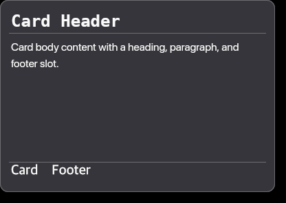
ImplementedContainer for grouping related content.
Table
ImplementedStructured data display with rows and columns.
Tab Bar
ImplementedNavigation between content panels.
Tab Panel
ImplementedContent area switched by tab selection.
Scroll Area
ImplementedCustom scrollbar for overflow content.
Data List
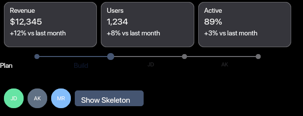
ImplementedKey-value pair display.
Overlay/Navigation
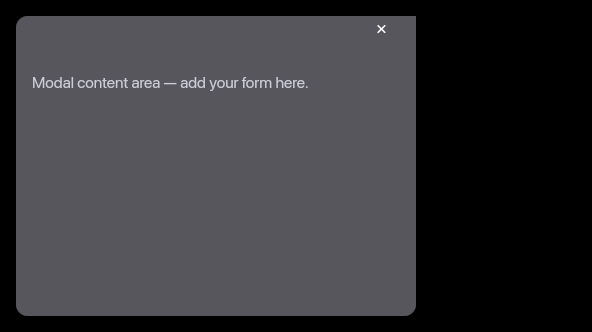
Modal
ImplementedDialog overlay for focused interactions.
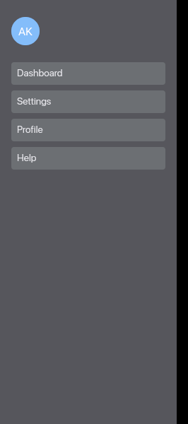
Drawer
ImplementedSlide-in panel from screen edges.
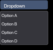
Dropdown
ImplementedContext menu or action list.

Navbar
ImplementedTop navigation bar with responsive menu.
Typography

Heading
ImplementedSection headings with consistent hierarchy.
Paragraph
ImplementedBody text with proper line height and spacing.
Special
Canvas
ImplementedLOD rendering with portals for interactive detail.
Data Item
ImplementedIndividual data point display.
Roadmap
Coming next.
These components are planned and will be added to the library.
Accordion/Collapse
PlannedExpandable content sections.
Breadcrumb
PlannedHierarchical navigation trail.
Pagination
PlannedPage navigation for lists.
Command Palette
PlannedKeyboard-driven command interface.
Popover
PlannedFloating content triggered by a button.
Skeleton
PlannedLoading placeholder content.
Avatar
PlannedUser profile image display.
Calendar
PlannedDate picker with month view.
DatePicker
PlannedDate selection with calendar popup.
Toast Stack
PlannedStacked notification queue.
Snackbar
PlannedBottom-aligned notification.
Bottom Sheet
PlannedMobile-friendly slide-up panel.
Split Pane
PlannedResizable two-panel layout.
Resizable Panels
PlannedMulti-panel adjustable layout.
Combobox
PlannedSearchable dropdown with filtering.
Date Range Picker
PlannedStart and end date selection.
File Input
PlannedFile upload with drag and drop.
Contributing
akar is open source. Contributions are welcome — whether it's implementing a planned component, fixing a bug, or improving documentation.